Here I'm exploring a couple of ways to display Contested Possession statistics when comparing two teams ; in this case Collingwood and Gold Coast for 2011 (ie top and bottom team on the ladder).
First, using a dotplot with the teams identified by different coloured dots :
( qplot(Round ,CP_Percent,data = cp, colour = Team)
There is a clear differentiation between the red and the blue dots, even though there is some overlap.
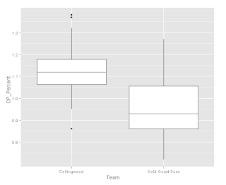
A boxplot makes the difference between the teams very clear :
( qplot(Round, CP_Percent, data = cp, geom = c("line", "point"), group = Team, colour = Team, main = "Contested Possession Ratio - 2011 Games") )


No comments:
Post a Comment